Table of Contents
SETTING UP A USER TO RECEIVE PEAK LOAD ALERTS
To set up a user to receive peak load alerts, hover over your account name on the upper left corner and select Alerts from the drop down. Add a New Alert by entering the name, (ex: Peak Load Alert), description (ex: Alert if demand is over 10% of demand from last billing period), and type (ex: variance).
One example of an alert: when the most recent invoice (usage) is above or below the previous month’s invoice by 10% for the selected account
PEAK LOAD MANAGEMENT NAVIGATION
On the left side navigation bar, you will find the Peak Load Management tab.
REGIONS
On the top right, Peak Load is broken down into four sections/three regions: NYISO, ISO-NE, PJM-Capacity and PJM- Transmission because each ISO calculates it slightly differently.

DATE RANGE
On the right, under the different regions, you can change the date range in order to find the information for the specific time frame you are looking for.
DEFINING PERIOD
You can choose how the data in the bar graph is viewed by selecting a period from the top left corner. The data can be represented in the following periods: YTD, 1 Month, 1 Week, 1 Day, or All. Custom time periods can also be selected using the From and To dates on the top right, or by using the slider on the bottom overview portion of the graph to select the desired timeframe.
DATA SUMMARY
On the top of the bar graph, there is a dark grey line that represents the Max Peak - every
dates’ peak load is being compared to that number in the graph. The peak load for each date is represented in the blue bars. When the bars are green, the forecast is less than 90%, when it’s yellow, it's between 90-95% and when it’s red it’s less than 95%. For PJM-Capacity there is a
purple map key that represents preliminary and another grey line that represents the fifth highest reading YTD.
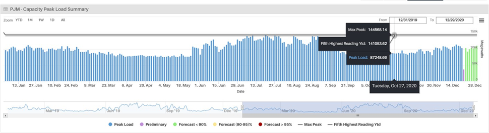
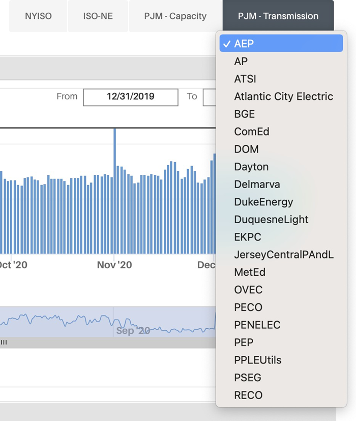
You can toggle the different data sources on and off depending on what information you would like to view. PJM-Transmission also has preliminary data shown in purple along with the ability to change the load zone. Transmission is based on the load zone set by the state - NYISO and ISO-NE is based on one peak hour, while PJM is the average of five. You can pick the load zone (AEP, ComEd, PECO etc.) by toggling the arrow under PJM-Transmission
USING THE SLIDE BAR
Below the bar graph is a smaller line graph with a slide bar that can be used to move the dates and change how detailed the data is. When the range chosen is smaller, the bar graph gets larger because there is less data to be presented in turn making it more detailed. As the range gets larger, the bar graph gets smaller, but with more information being presented. When all or almost all of the slide bar is toggled (showing all the data range selected), the bar graph shows less detail in order to represent the large amount of data.
EXPORTING DATA & IMAGES
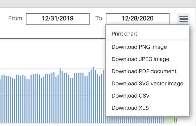
By clicking on the hamburger button to the right of the date range, you get the options: Print Chart, Download PNG Image, Download JPEG Image, Download PDF Document, Download SVG Vector Image, Download CSV, and Download XLS. Select which works best for your use case, and the file will download.
FORECAST DEFINITION
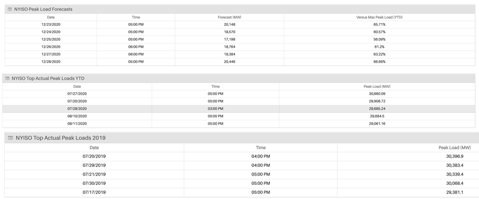
Towards the bottom of the page are the ISO’s Peak Load Forecasts. These are the usage predictions (in MW) for the week which are then compared to the Max Peak Load YTD (year-to- date) shown in percentages.
Underneath the Peak Load Forecasts are the Top Actual Peak Loads YTD with the five dates on which the Peak Load (shown in MW) was at its highest.
At the bottom are the Top Peak Loads for the prior year in the same setting as the above.
Was this article helpful?
That’s Great!
Thank you for your feedback
Sorry! We couldn't be helpful
Thank you for your feedback
Feedback sent
We appreciate your effort and will try to fix the article